
Statistics have always been an interest of mine. Maybe not to the degree that I wanted to do math for a living, but when you tie it in to my line of work, you get information graphics. There are so many ways to illustrate any and all types of information. They range from something as simple as a bar graph comparing the number of apples to the number of oranges at the store, to a virtual community representing the "Village of 100 People" statistical breakdown. Statistics themselves don't do it for most people, but when displayed properly through design, the numbers are then given a greater sense of meaning. One of my favorite groups that creates info graphics is GOOD magazine. I browse around image banks on the internet quite often and whenever I run across a graphical chart that catches my eye, more often than note it came from a GOOD magazine spread. They bring to light a variety of social issues by using information graphics that are otherwise lost in the myriad of numbers that most people don't grasp. One of my favorite graphics they put out was a timeline representation of the all-important first 100 days in office of our last 12 presidents. They say that time frame is a good indication of how the rest of the president's tenure in office will turn out. Factors included in the timeline are major events, what they inherited when coming into office, and popular vote. (Source: http://awesome.goodmagazine.com)
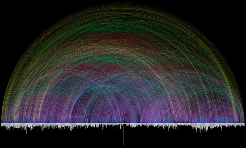 Another chart that I've stumbled across that's amazing when considering the sheer scale of it is Chris Harrison's "Visualizing the Bible." His graph links all the textual cross references found within the Bible, more than 63,000 of them. It wasn't really built to be a functional chart, but the visual impact that it brings is immense. The bar chart along the bottom represents each chapter in the Bible, and the two different tones divide each book. The distance between the two chapters referenced were color coded, giving the chart a rainbow-like effect. This project was quite the undertaking, but the results are beautiful. (Source: http://www.chrisharrison.net)
Really the thing that got me to write this post is the annual reports that Nicholas Felton designs. The twist is, they're not annual reports for some national company. They're annual reports about himself. He painstakingly logs many details about himself throughout the year: the number of miles he's walked, the number of restaurants he's been to, etc. And he's been doing this for a couple years. I decided that I wanted to try this too. Yeah, it may be a lot of trouble, but it'll be a learning experience too. I'm sure I'll find out new things about my habits and personal traits, especially when putting it on a one-year scale. To keep me to it along the way, I'll probably post a spread of a few items each month before compiling a large one at the end of the year. We'll see how it goes, right?
8 years ago
1 comment:
Good luck. I'm intrigued.
Post a Comment